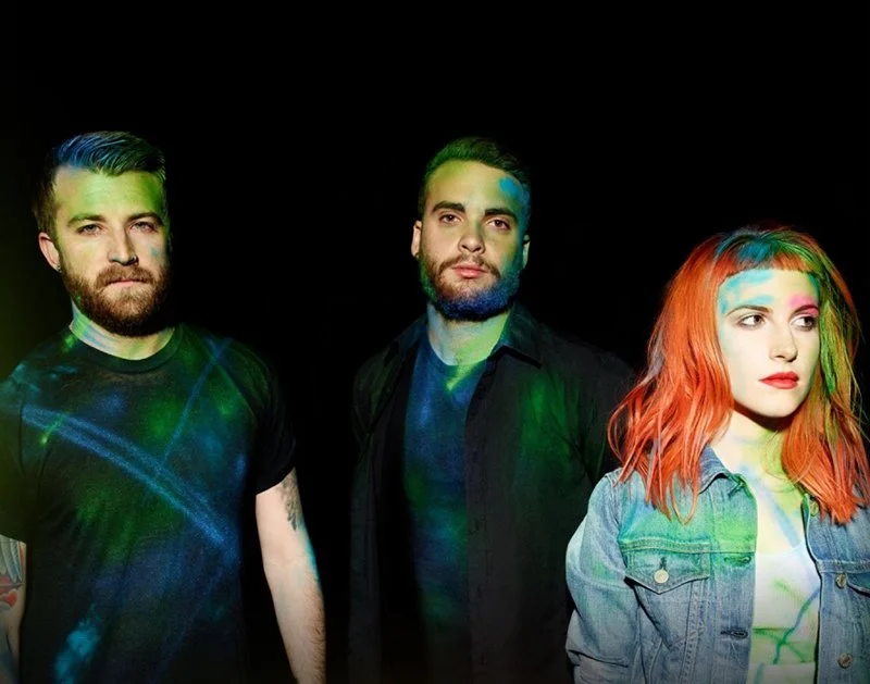
Paramore
Visual design, ux/ui
In 2013, The newly launched Paramore website was the largest, most extensive site Atlantic Records had developed to date. The responsive design utilized custom layouts adhering to mobile, laptop and larger screen devices. I collaborated with a team of developers to brainstorm, test and revise designs that would accommodate grids we could use for all of our future artists sites.
Project:
Paramore Website
TIMELINE:
Nov 2012 ➝ April 2013
ROLE:
Visual + UX Designer
Skills:
UX/UI, Website Design, Wireframing, Prototyping
║the challenge║
Design a new experience for Paramore fans
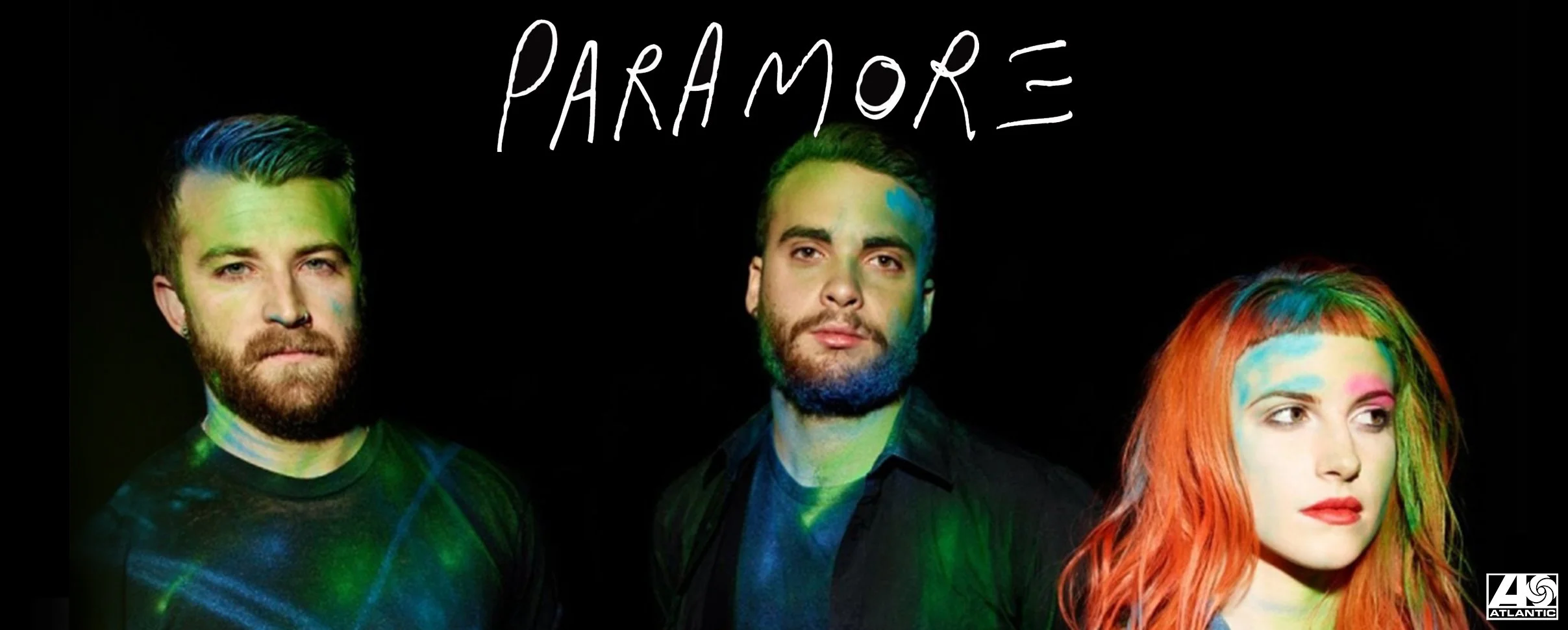
Our challenge was to create a new, more engaging experience for Paramore fans to help promote the launch of their new album Paramore.
║ideation║
Wireframes
Working with developers, I created low-fidelity wireframes depicting fan-favorite content sections and new ways for users to view photos, videos and interact with other members of the community.
║visual design solution║
Final Designs
Below are the final designs created for the Paramore website. Collaborating with the development team, we strived to create an entirely new experience for Paramore fans, one that was more engaging and better suited to their needs and desires.
║takeaways║
Impact
The overall response was extremely positive. Fans from all over the world tweeted their excitement for the new site launch and expressed their enjoyment in using the custom features and functionalities. The design was also featured on a blog listicle for 20+ Best Web Design for Rock Band.
Direct Feedback + Passion for UX
Designing the Paramore website is still one of the most rewarding sites I have ever worked on. The band, managers and team at Atlantic were not only amazing to collaborate with, but it was the first time I was given the lead role in conceptualizing wireframes, prototypes and designs for an artist. It was gratifying to receive immediate, direct feedback from Paramore fans and officially jump started my passion for user experience.

