Post Sports+
RESEARCH, VISUAL DESIGN, UX, USER FLOW, DESIGN SYSTEM
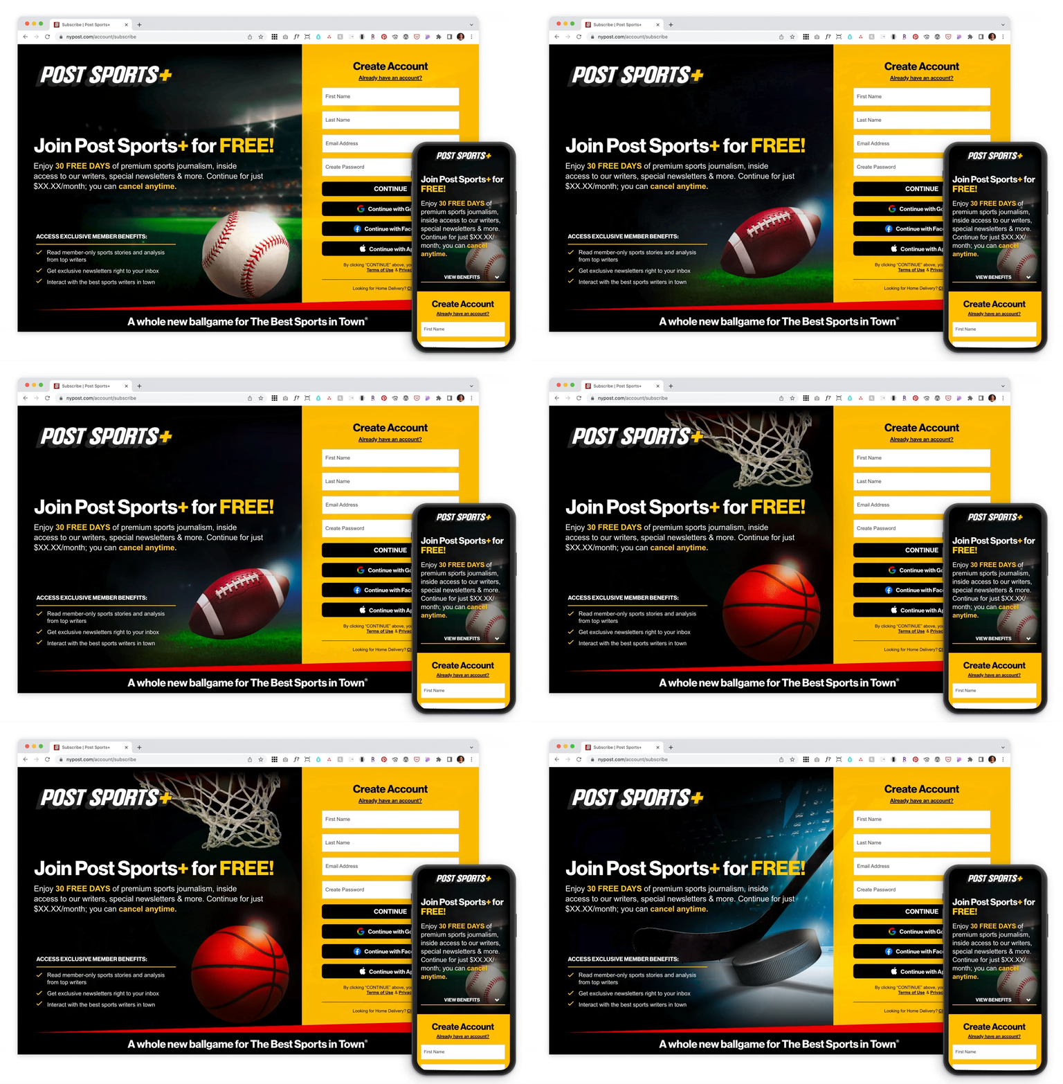
In the fall of 2021, The New York Post launched Post Sports+, a new membership experience bringing premium sports journalism to the die-hard sports fans.
I had the privilege of collaborating with the digital design team to conduct market research and design the final experience for the Phase 1 and Phase 2 user acquisition flows.
Project:
timeline:
Feb 2020 ➝ Present
ROLE:
Visual + UX Designer
Skills:
UX, Visual Design, Product Design, Branding, Design System, Research, Acquisition, User Flows, Payments, Wireframing, Prototyping
Phase 1
║the Challenge║
Create an Account + Complete Checkout
Our challenge was to create an acquisition flow for Post Sports+ membership that will prompt users to successfully meet two objectives:
Sign up with an email address to create an account.
Reach the confirmation page to complete checkout.
║research║
Goals and Insights
Working in an agile framework, we applied the design-thinking method and began our research to better understand how our top competitors approach acquisition flow, specifically from a Gated Article entry point. Through discovery, we noted several sports and editorial subscriptions sites with similar flows and established the following research goals:
market research ➝
Based off traffic data from google, comscore and quantcast, a competitive analysis was conducted on the top sports and editorial subscription sites. We studied the UX/UI on gated articles, common variables, language and the number of steps used in the acquisition flow. In total, we analyzed 14 of our top competitive sports sites and 4 top sports and editorial subscription sites.
Research insights ➝
Below are some highlights we discovered when analyzing the data. All findings were then organized into a presentation deck and shared with stakeholders.
║ideation║
User Types + Wireframes
Before creating wireframes, the digital team and I had to first figure out who our user types are. This would span from anonymous users first coming to the site to registered users who may have cancelled and would like to sign up again to become a member. Once these flows were established, I created medium fidelity wireframes based on our competitive analysis to present to our team and stakeholders.
User Types
Wireframes
║visual design solution║
Phase 1 Designs
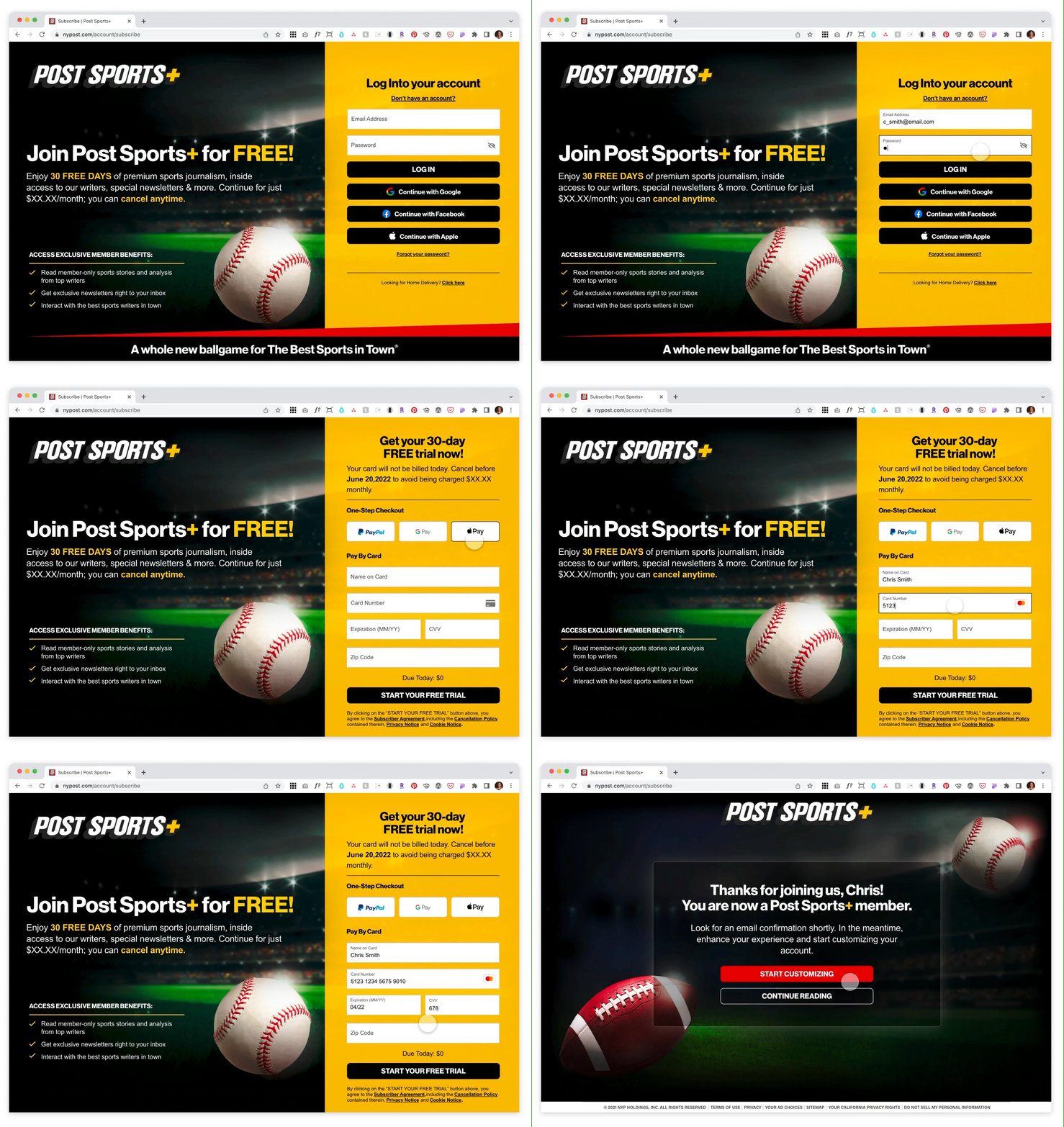
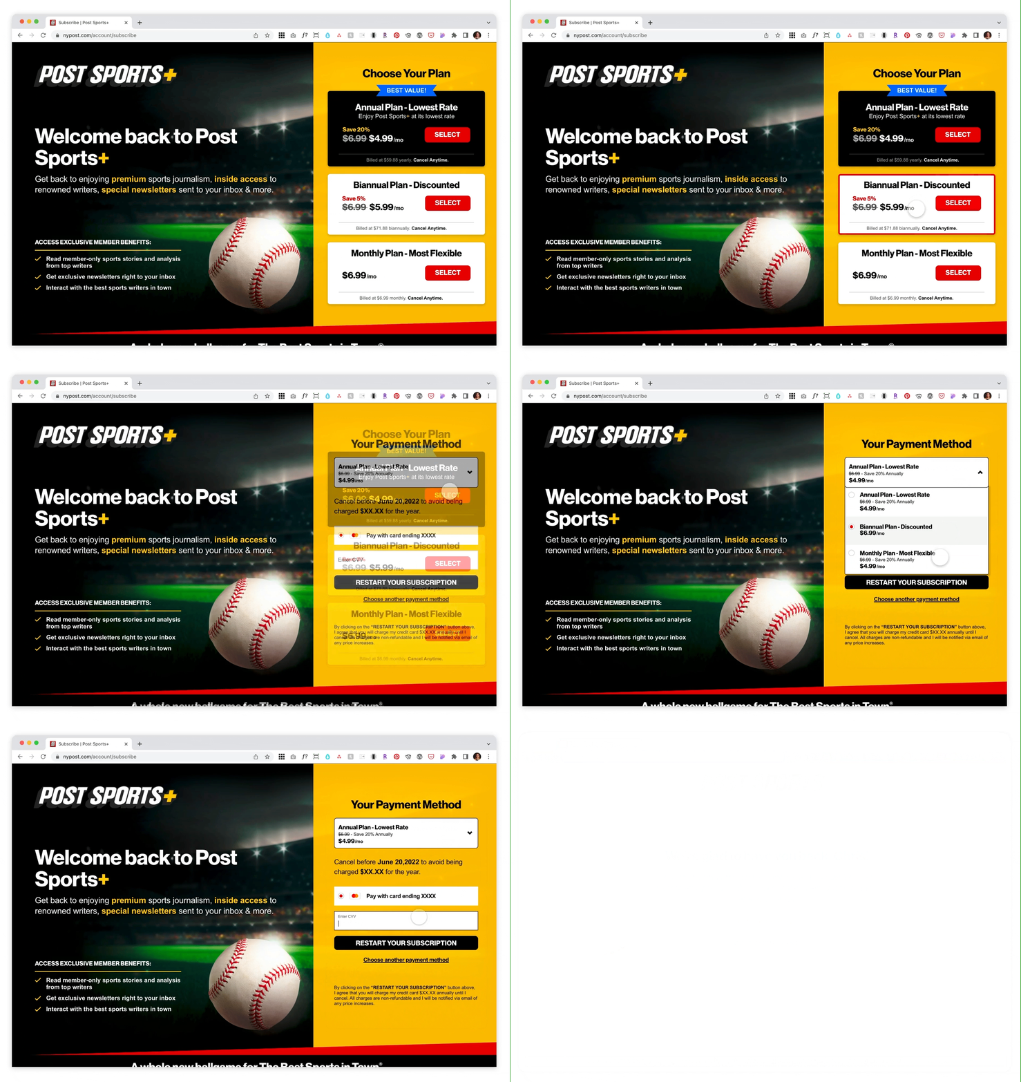
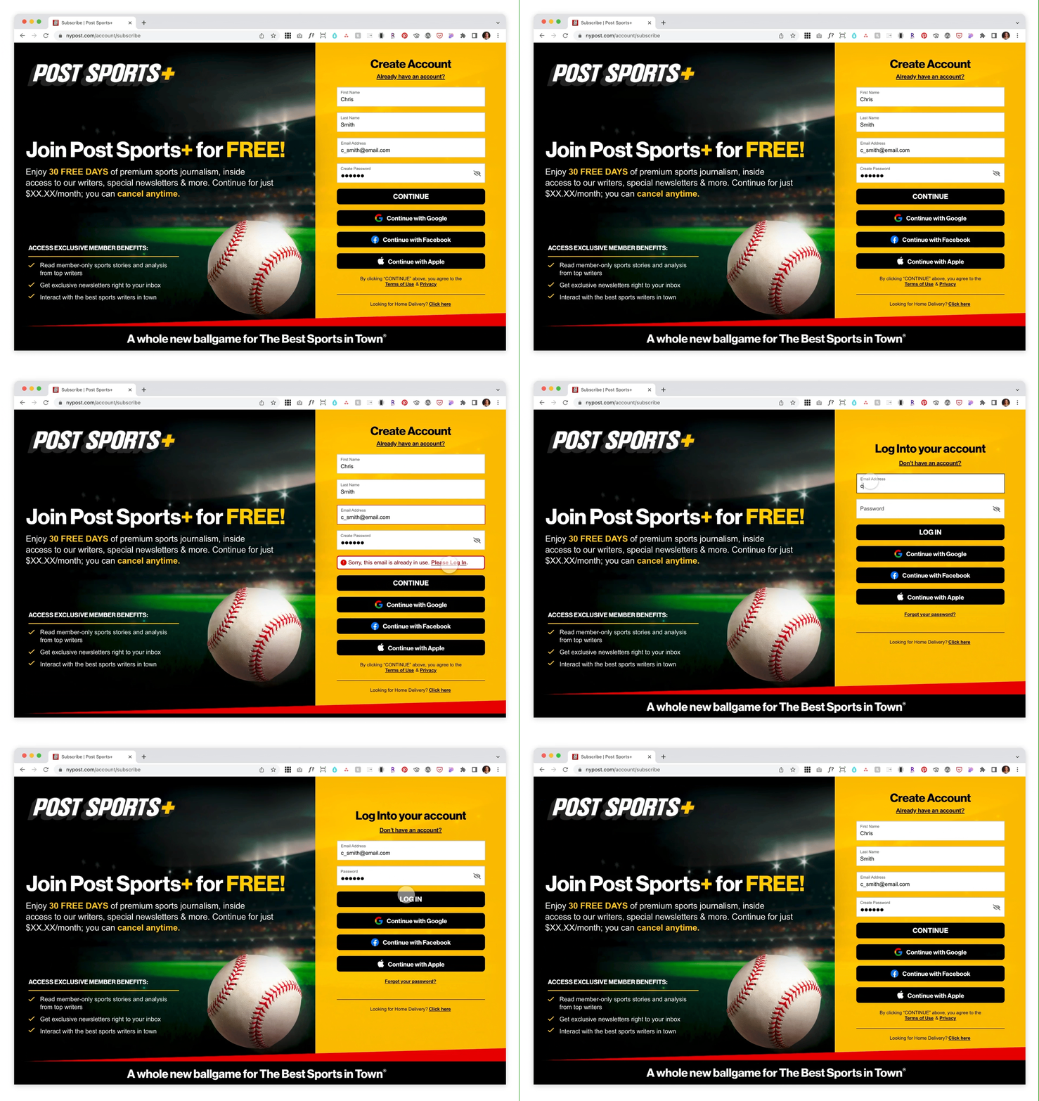
With market research, several rounds of wireframes and prototyping for both desktop and mobile, I created the visual design and experience for the Acquisition Flow on a Gated Article page. This included the Create Account, Log In and Payment flows for all user types.
Gated Article content preview
User Type Flows for Account Creation and Payment
Anonymous User ➝
An anonymous user is taken to the Create Account and Payment page to start a free trial.
Registered User ➝
A registered user is taken to the Log In and Payment page to start a free trial.
Cancelled User ➝
Once a cancelled user logs in, they are taken to the pricing page to resubscribe.
Member ➝
Once a member logs in, they are greeted with a welcome back message as they have already subscribed.
║specs║
Deliverables
To prepare for development, I created the dev and design paddings for each flow, and exported all necessary assets. These assets include design mocks, background images and svg assets such as social icons, graphic elements and arrows.
Paddings ➝
design system ➝
With the launch of a new membership platform, we decided it was best to create a design system that was scalable and easily understood by all teams and stakeholders. I collaborated with the digital design team to create boards identifying all styles, components, widgets etc. used throughout the Post Sports+ experience. These elements included all headings, body fonts, buttons and dropdown components that live within the Gated Article and Acquisition flow.
Phase 2:
As design is an iterative process, the digital design team and I began phase 2 on the Payflow experience shortly after launch. We evaluated its success, studied areas of improvement and created recommendations based on additional research and AI testing.
║the Challenge║
Improve bounce and conversion rates
Our challenge was to create recommendations for Payflow that would raise member benefit awareness to improve bounce and conversion rates.
║research║
Research and Insights
Confusion and Uncertainty. This was a common theme reflected in both user responses and the high bounce rate data studied after launch. It was clear users were hesitant and unsure of what they were being offered in a Post Sports+ membership. As a result, the team and I quickly went back to our market research and further analyzed how our competitors were promoting their service, presenting their benefits and enticing users to convert.
Market Research ➝
In our research, we studied the top sports subscription sites, including fantasy sites. We analyzed common elements featured in the benefits module (ie. imagery, icons, checkmarks), the layout of each section, and if testimonials were used to increase engagement.
Research Insights ➝
Below are some highlights we discovered when analyzing the data. All findings were then organized into a presentation deck and shared with stakeholders.
║recommendations║
Payflow Recommended Additions
In collaboration with copywriters and the marketing team, we began to strategize a better solution based on our competitive analysis. As a result, we designed four additions to recommend for Payflow. This included a learn more anchor link, where users can easily click and be taken to a more detailed benefits module. The benefits module will include large images and additional descriptions so users can further understand what they will receive in a Post Sports+ membership. We also designed a testimonials section with current member quotes and a persistent anchor bar so that users can quickly be taken back to the Create Account section and easily sign up. I designed the pages for desktop and mobile, tested and refined based on the visual AI tool 3M VAS results and presented them to stakeholders.
║visual design solution║
Final Designs
In Phase 2, we continued the iterative design process and further researched, defined, ideated, prototyped and tested our designs so that we could successfully meet the needs of our users and stakeholders. Below are the final designs I created for the recommendations made to Payflow. *Special thanks to copywriter Sean Treppedi for his expertise and providing the additional copy to help further clarify the membership benefits to our users.
║takeaways║
Impact:
At launch, page views on Payflow pages reached 2.8M
Traffic from new users increased by 22%
Research, Testing, Rinse + Repeat
Working on Post Sports+ from concept to launch has taught me so much about the design process and gave me the opportunity to further advance my UX skills. Creating this product from scratch showed me the importance of team collaboration and how essential research and testing is to creating the final designs. I truly enjoyed conducting market research, analyzing the data. testing and re-testing all prototypes to make sure we were delivering the best product to our devoted sports fans.


